Currently open to senior creative leadership roles — full-time or fractional.  Let’s talk →
Rick Gore
Rick Gore / Work / Nintex
Nintex

A new brand.
A new function.
A new operating model.

How I rebranded a global process automation platform, built a creative team from near zero, ran campaigns at scale, and turned a three-day sales meeting into a flagship annual event.

Company
Nintex, Bellevue WA
My role
Creative Director — rebrand, team build, campaigns, events
Tenure
2023 — 2025
Disciplines
Brand Identity · Creative Operations · Campaign Architecture · Experiential Design · Team Build
Nintex — The Possibility Engine brand identity
Nintex, rebranded. The Possibility Engine, in market.
19
Creative team built from near zero in 18 months.
2,500+
Branded artifacts touched in the rebrand rollout — three months, alongside everything else.
17+
Branded events and activations produced per year.
2
Years running Evolve. The second ran smoother than the first.

When I joined Nintex in 2023, the creative function was one part-time designer filling requests. A marketing idea would form somewhere in the org, land on her desk, and she would produce it if she had time. No sequencing, no shared visual language, no campaign thinking. A tradeshow booth here, a banner ad there, each one disconnected from the next.

There was also a rebrand nominally in progress with an external agency, but they had been circling for months without producing anything that held up. The brand itself was consistent but dated. Very 2017 enterprise tech. Unmemorable in a category full of companies that looked exactly the same.
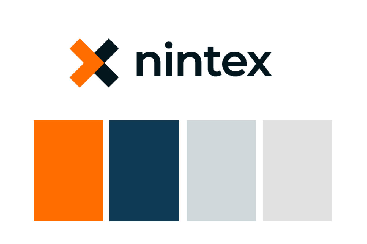
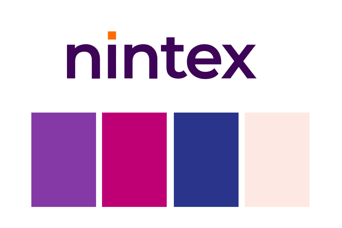
From "generic enterprise tech" to The Possibility Engine.

The agency had work in progress, but it needed direction, not execution. I stepped in, redirected their output, and did the strategic work myself: developing the color palette that became the foundation of the new identity. A second agency built out the full brand guidelines from that foundation.

The tagline I wrote was The Possibility Engine. It was built to do what the old brand could not: stake out a position specific to Nintex, not interchangeable with every other process automation platform in the category. A name that pointed at capability and aspiration at the same time.

Nintex brand before the rebrand

Before

Nintex brand after the rebrand — The Possibility Engine

After

Nintex brand identity system — palette, typography, mark, visual language
The new Nintex identity system. Built to be immediately distinct in a category where every competitor looks the same.

2,500 artifacts. Three months. On top of everything else.

A rebrand is not finished when the guidelines ship. It is finished when the new brand is everywhere the old one was. At Nintex that meant somewhere around 2,500 unique artifacts: every sales deck, every data sheet, every ad unit, every event asset, across every department and global market.

I designed the rollout before we touched a single file. Every department stakeholder audited what they owned and stack-ranked it: must-do at the top, nice-to-have at the bottom. That gave me one prioritized list per department instead of twelve competing emergencies. From there it was a matter of assigning work through the pipeline and running it. We cleared the must-do list in roughly three months without stopping any of the other marketing work in flight.

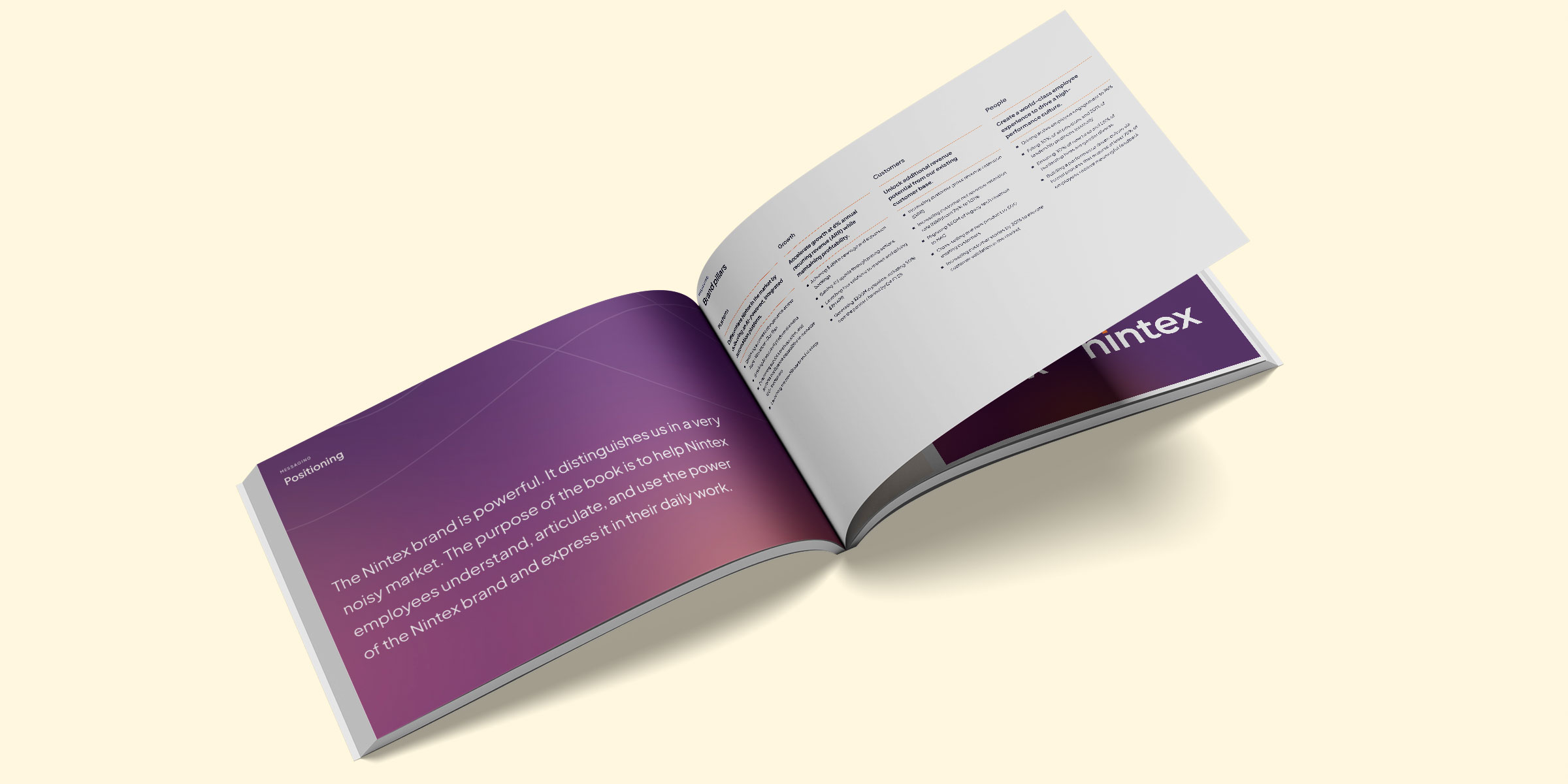
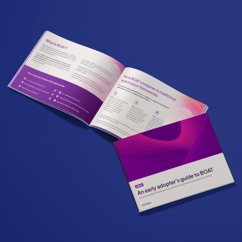
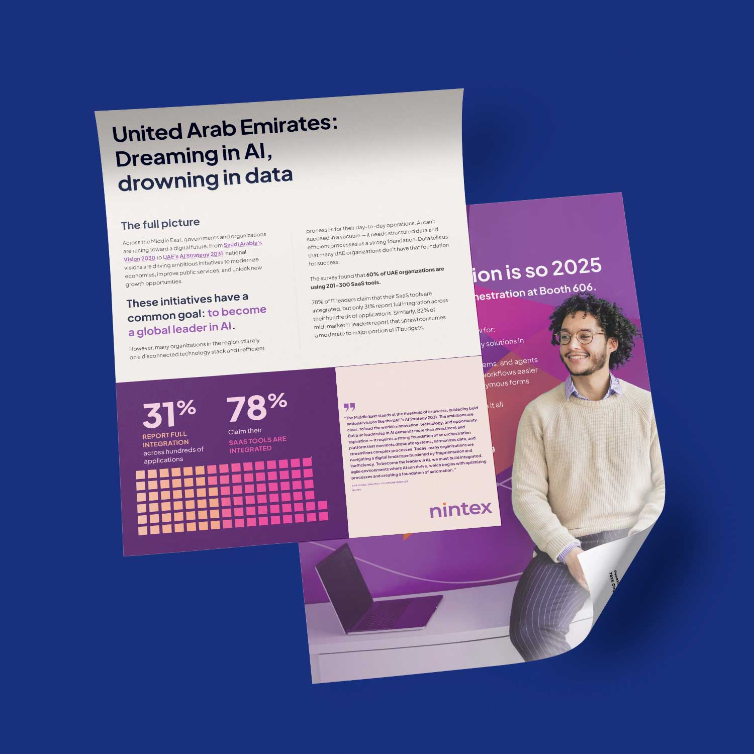
Nintex collateral in new brand Nintex collateral in new brand
A portion of the content library produced under the new brand. Sales sheets, ebooks, data sheets — a consistent visual language at volume.
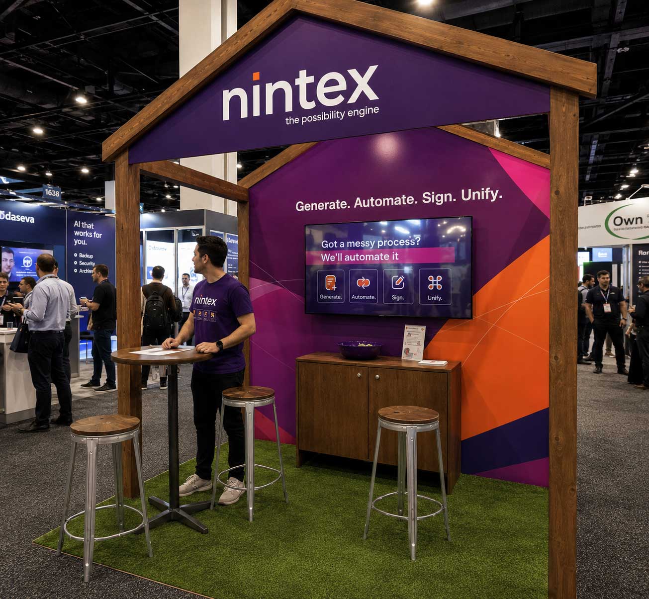
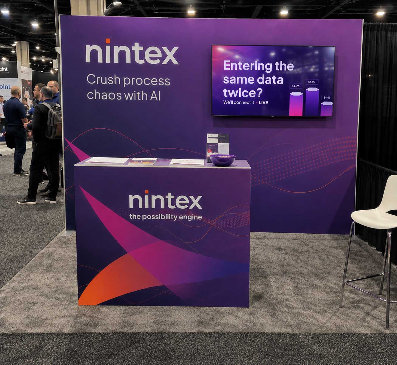
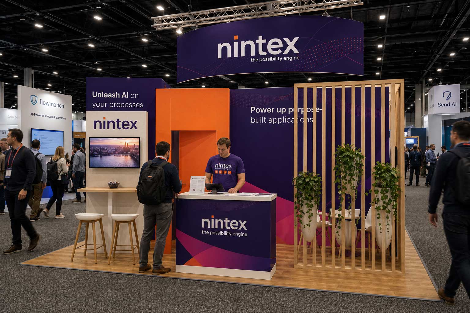
Nintex booth at AgentForce, Sydney Nintex booth at Microsoft Community Conference
Nintex booth at ECS Dusseldorf
The new brand in market. AgentForce Sydney, Microsoft Community Conference, ECS Dusseldorf.

We couldn't win on floor space. So we built somewhere better to be.

Our Dreamforce booth was small. The Moscone floor is a war of real estate, and we weren't going to win it on square footage. So instead of competing for attention on the show floor, we rented an office one block from the Moscone Center, named it the Nintex Recharge Club, and built a destination worth leaving the floor for.

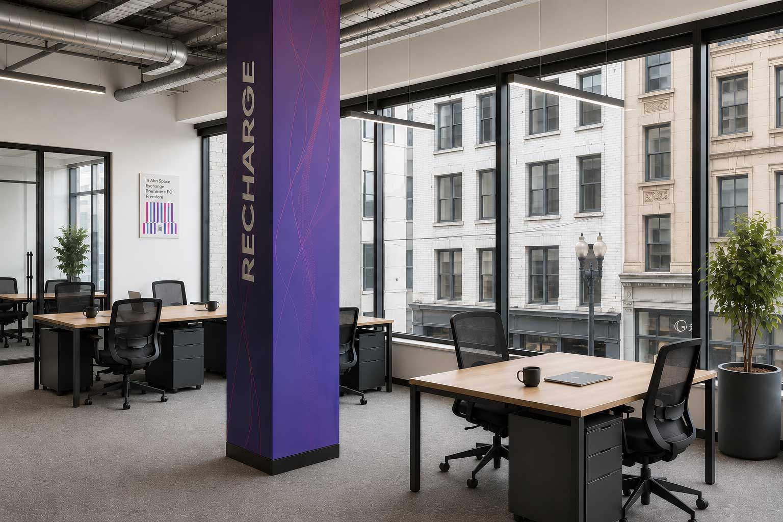
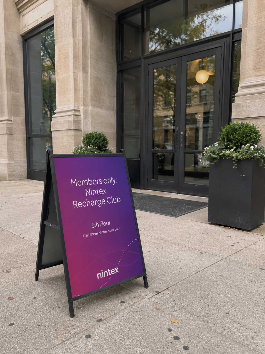
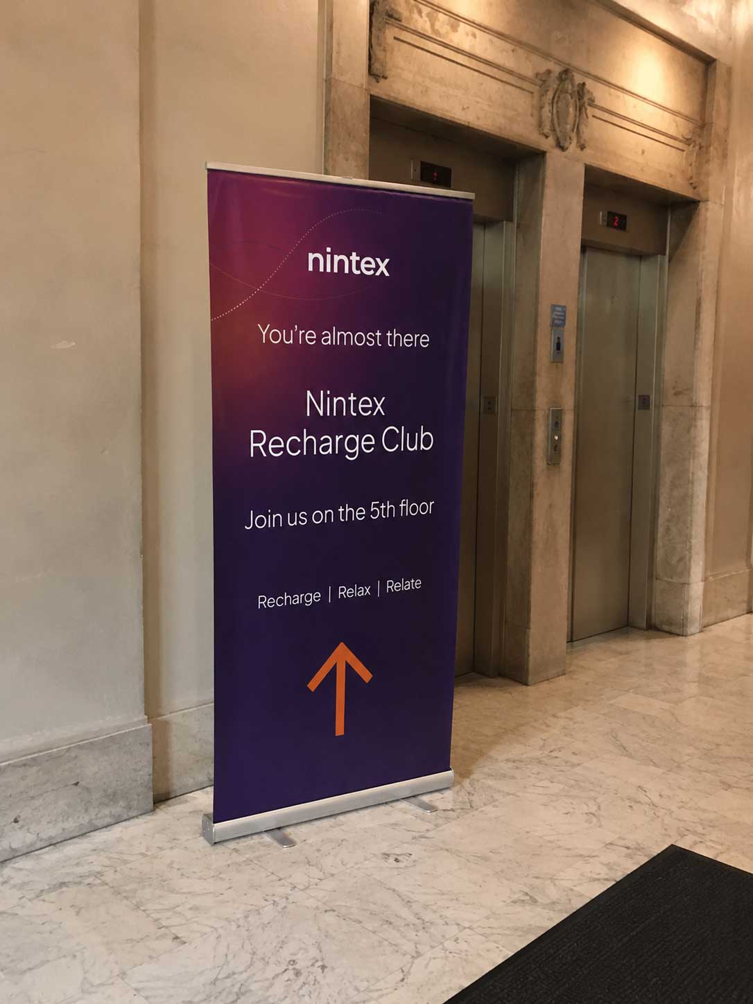
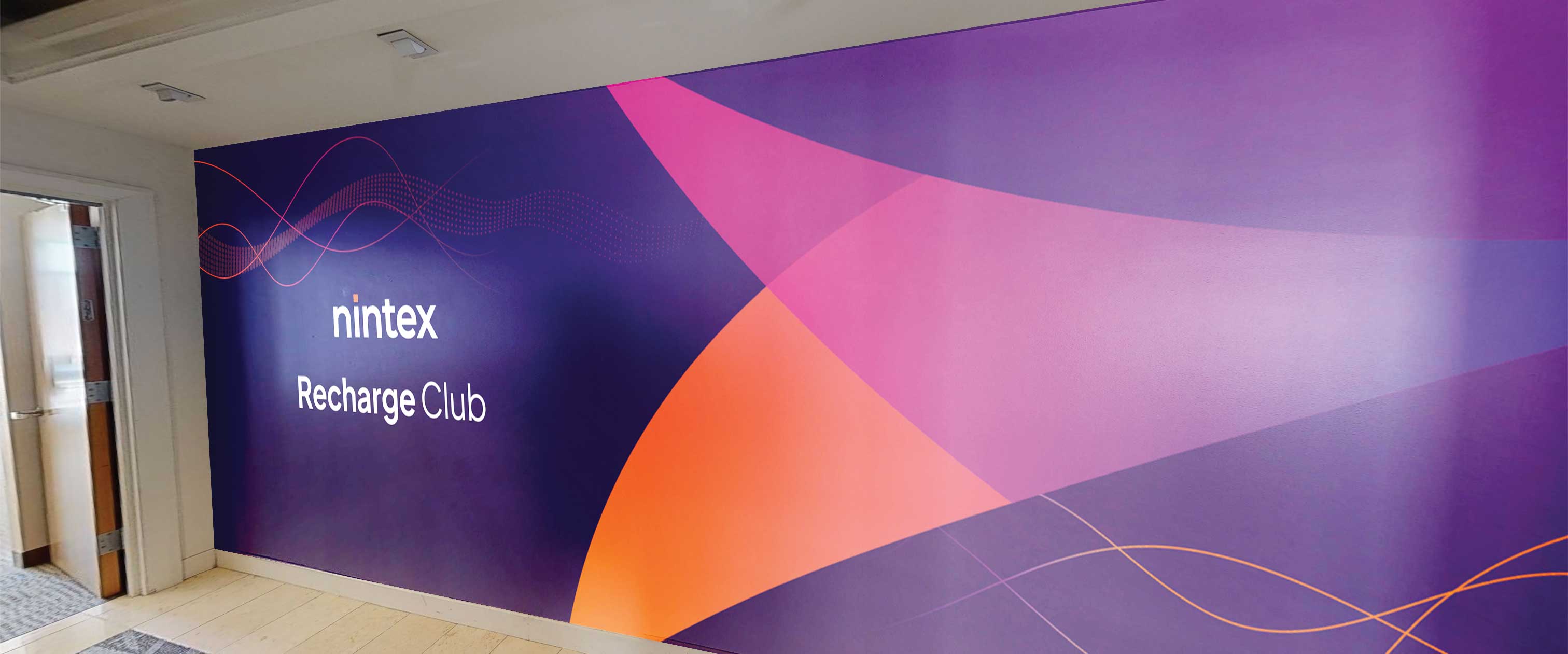
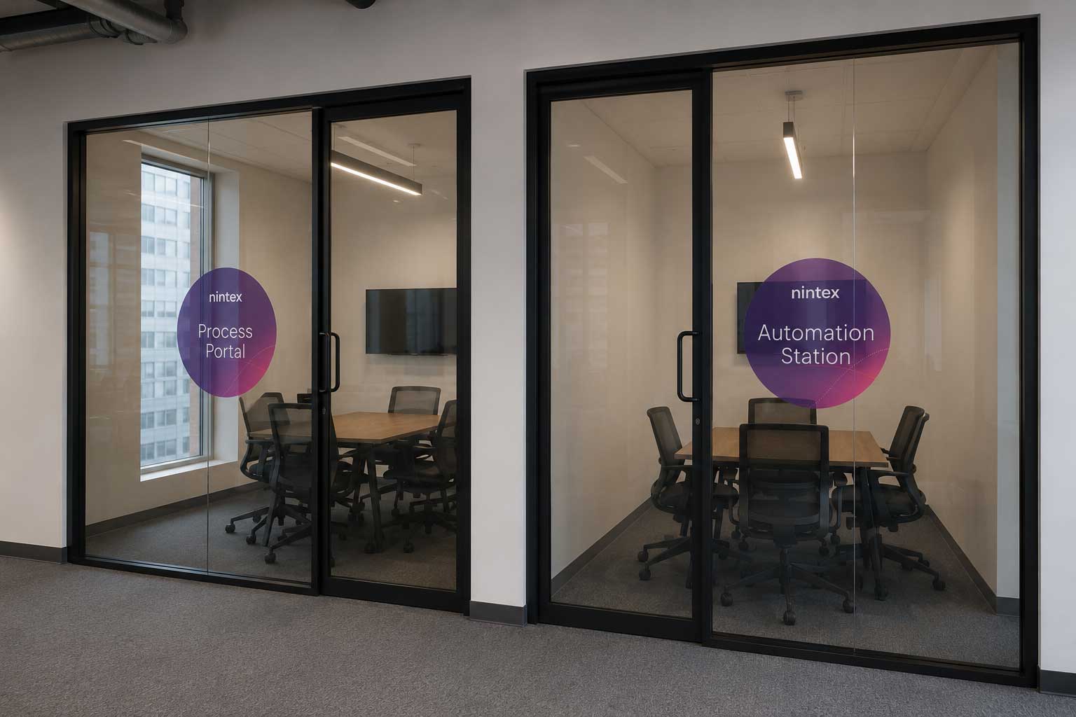
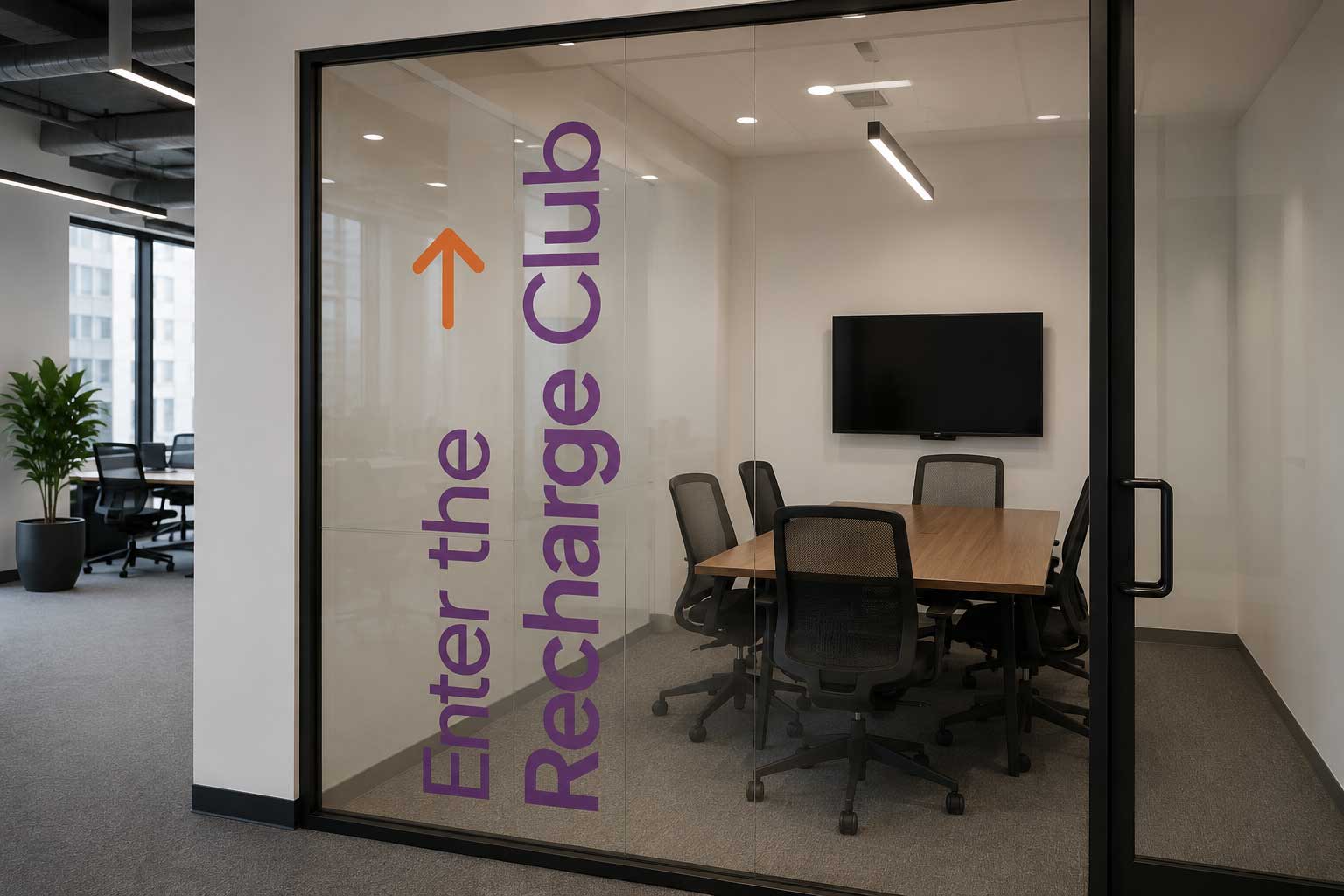
The space got the full treatment: wall wraps, a branded column, window clings, framed posters, and A-boards out front. Conference rooms were named and signed — Process Portal, Automation Station. Booth attendees received secret VIP cards. The lobby got wayfinding. Even the drink menus were on-brand.

A conference attendee in a quiet, well-designed space is in a completely different headspace than one standing in a 10x10 booth. That headspace is what we were designing for.

Nintex Recharge Club — branded RECHARGE column
Nintex Recharge Club A-board outside the building Nintex Recharge Club roll-up banner in lobby
Nintex Recharge Club wall wrap
Nintex branded conference rooms — Process Portal and Automation Station Enter the Recharge Club window cling
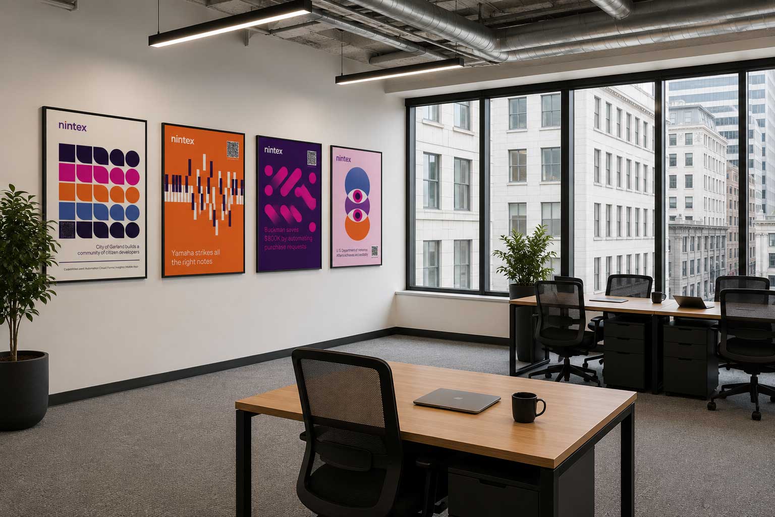
Nintex postcard posters hung as art in the Recharge Club
The postcards, displayed as art. Street-level Moscone attendees walked past a 10x10 booth and into this.

A three-day slide meeting became the event the sales org looked forward to all year.

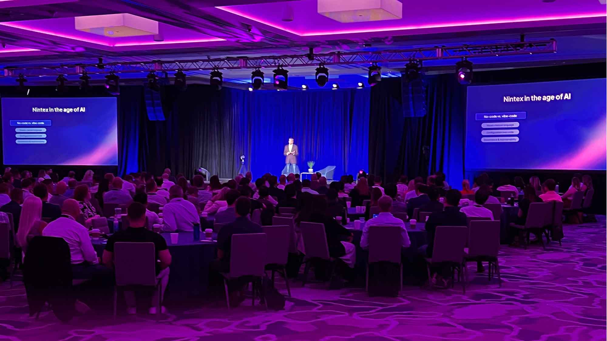
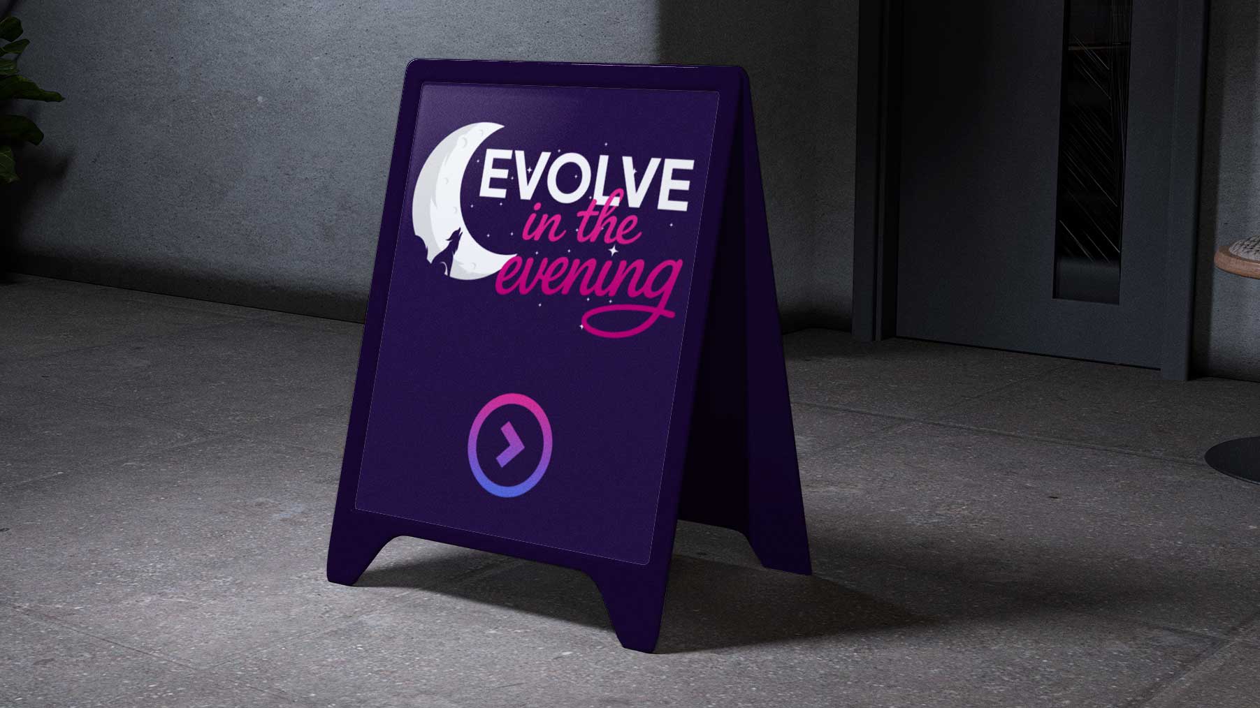
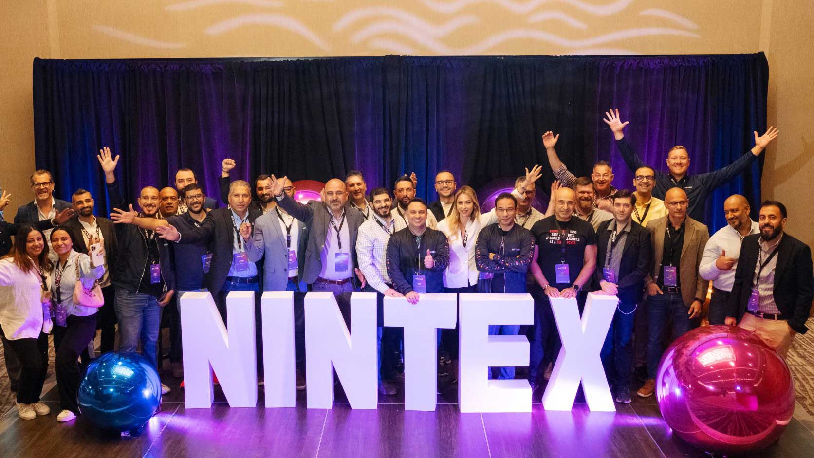
The Nintex sales kickoff had no name, no identity, no energy. I named it Evolve, built a complete visual system for the event tied to the new Nintex brand, and designed everything from the first email invite to the award ceremony. Lobby banners, wayfinding, stage design, presentation templates, swag, activations. Nothing unbranded, nothing an afterthought. About 300 people in the room. The second year ran on the system built in the first.

Nintex Evolve main stage, Hyatt Regency Lake Washington
Nintex Evolve, Hyatt Regency Lake Washington.
NINTEX letter installation Evolve photo opportunity installation
Evolve 2025 opening video. Custom-built to warm the room before the first speaker took the stage.

In eighteen months, one designer became nine. A stalled rebrand shipped to market. And a creative function that ran on an intentional system.

I left Nintex with a rebranded company, a nine-person team on a real operating model, a campaign program with a developed strategic framework, and an event that had already run twice and would run again. The rebrand touched 2,500 artifacts across 12 departments in roughly three months without interrupting the work already in flight.

The thing worth noting: the rebrand, the team build, the campaigns, and the event all happened simultaneously. None of them waited for the others to finish. That is what a functioning creative operation looks like when it is built right.

The Possibility Engine

One part-time designer. A rebrand going in circles. Eighteen months later: a new brand in market, 2,500+ artifacts rolled out, four campaign architectures developed, and a flagship event running on a repeatable system.

Next case study
Avalara: Building a creative function from scratch